Quick fix for CSS animation performance
If you're gonna start adding css animations to your projects or if you're using them already, there's a few tips you should know that will help you improve your animation performance, optimize the rendering and prevent using unnecessary GPU.
In case you need complex animations or transitions, I would really recommend you checking other alternatives like framer's motion for react, or similar dedicated libraries. This post will focus on pure CSS animations.
Perfomance on animations
Imagine we need an element moving from left to right on an infinite loop. One way of doing it could be:
<div class="container">
  <div class="element"></div>
</div>
.container {
border: 1px solid red;
width: 100vw;
height: 10rem;
position: relative;
}
.element {
position: absolute;
width: 5rem;
height: 5rem;
left: 0;
background: blue;
animation: left-to-right 5s infinite linear;
}
@keyframes left-to-right {
0%,
100% {
left: 0;
}
50% {
left: 100%;
}
}This will work, but there're a couple of problems with it.
If we run a performance test we'll notice that this animation is taking a lot of time on rendering and painting.
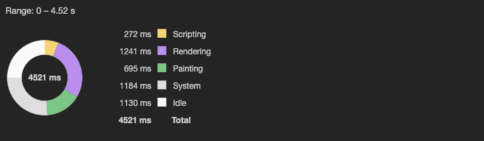 Devtools initial performance results
Actually, if we go to the "Experience section" there's a warning about Cumulative Layout Shift too
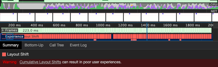 Cumulative layout shift warning
You can try it yourself. On chrome, you only need to:
- Create a new html file and copy the code
- Open it on your browser and then open the devtools
- Go to the Performance tab, and start recording.
- I'd recommend you changing the CPU configuration to "6x slowdown". This will allow you simulate how is gonna perform on slower devices.
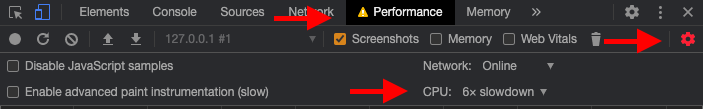 Devtools performance tab
This is happening because the browser is recalculating the layout position of the element on each frame and then is repainting it.
If run the animations at the recommended 60ftps framing, we will run into performance issues, specially for all the users with slow devices.
But this is not a problem of the left property only, this is also gonna happen on properties like: margin, width, height, padding, border, font-size, etc.
You can check the csstriggers.com website which includes information for most CSS properties and how the rendering waterfall is triggered by each one.
The transform property
The main difference between using transform and other properties like marginor left is that transform is rendered on their own layer and this will prevent it from triggering a layout recalculation.
This works similar as color and opacity on triggering a repainting, where opacity, at being rendered on their own layer, will be less expensive.
Now we can update or code using transform and run a performance test again.
@keyframes right-to-left {
0%,
100% {
transform: translateX(0);
}
50% {
transform: translateX(100vw);
}
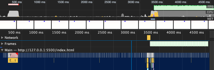
}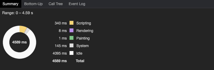 Devtools performance results
 Rendering Waterfall
After that minor change, we can see the difference, the waterfall rendering is less expensive, the rendering and the painting now are close to 0ms and the Cumulative Layout Shift warning is also gone.
The user's screen size has a major impact on how animations perform and are being displayed, so, be sure to test your project on multiple screens including mobile devices.