Building PlanetScale's new homepage
In February, we launched a new PlanetScale homepage. This was such a fun project to work on and collaborate with the brand team before all the recent changes, that I wanted to dive into the process, design decisions, and all technical implementations involved in this project.
Animating in view
Multiple elements are animated across the page when they enter the screen. Almost all were built by combining CSS transitions, data attributes, and intersection observers.
The useIntersectionObserver hook returns a ref for the element to observe, and an inView value passed to the element as data-animate attribute. Using tailwind we can check for when the value is true and change the styles to final values using CSS transitions to animate each element accordingly.
const AnimatedElement = ({ children }: { children: ReactNode }) => {
  const { ref, inView } = useIntersectionObserver({
    threshold: 1,
    margin: '0% 0px -50%', // Triggers only onces it hits the middle of the screen
  })

  return (
    <span
      ref={ref}
      data-animate={inView}
      className="opacity-0 -translate-y-2 transition data-[animate=true]:opacity-100 data-[animate=true]:translate-y-0"
    >
      {children}
    </span>
  )
}
In elements above the fold, the useIntersectionObserver hook was doing some unexpected flashing related to a mismatch with the initial state. Adding a prop for the initial value fixed it.
export function useIntersectionObserver<T>({
  // ...
  initialValue = false
} = {}) {
  const [inView, setInView] = useState<boolean>(initialValue)
  //..
}
The data-animate attribute also stops loop animations after each left the viewport.
.meshGradient[data-animate='false'] .waves,
.meshGradient[data-animate='false'] .blob {
  animation-play-state: paused;
}
Something I read about in the Crafting the Next.js Website article, and I've found extremely useful is using data attributes as an alternative to merging and flattening classes with something like clsx.
Data attributes are really convenient while working with Tailwind, it reduces style conflicts, and the linter will pick duplicated classes more effectively since all classes can be on the same line.
const Component = ({ active, description, children }) => (
  <div data-active={active} className="group bg-white data-[active=true]:bg-black">
    {children}
     <span className="text-black group-data-[active=true]:text-orange">
      {description}
    </span>
  </div>
)
Hero composition
For the hero, @ceciliorz wanted us to build something that felt like the next iteration of the PlanetScale gradient. Something that along with the pixel grid stars, could slightly give the vibe of Aurora Borealis.
Since this component starts above the fold, I also wanted to make it as light and composable as possible so we can progressible enhance it.
The hero is composed of multiple layers, each layer has different animation loops:
The pixel grid animation is using canvas, lazy loaded, and fades into the page after the initial page load is completed. For low-powered devices or users with reduced motion preferences, this animation isn't downloaded and is replaced with a static grid.
Diagram
While exploring alternatives and seeking a middle ground between scroll-jacking and preserving the natural feeling and motion of scrolling, We built it by composing multiple sticky elements and intersection observers.
The initial exploration had every item using intersection observers along with root margins that triggered once each hit its final position. It was working well for scrolling up to the bottom, however, since all elements were visible at the end, was quite broken scrolling back to the top.
Instead, the final implementation has an additional list of elements for the observers. This way, only one element is active at the time, and simplifies the order of each element.
To vertically align all elements in the middle of the screen, from small devices to 4K monitors, while ensuring they scroll out of the viewport at the same time, each component consists of two parts: a full-height sticky container, all sharing the same --top-position, and a card with a position relative to the parent to place it in the respective part of the diagram.
Every time the current active element changes, it updates two parts, the card styles, and the respective section in the diagram. Each part is placed in different nested components, and since only styles are changing, an alternative to a context or prop drilling was using data attributes at the closest shared parent and updating the rest with CSS selectors.
.planescaleDiagram[data-active='devops'] [data-diagram-details-devops],
.planescaleDiagram[data-active='vitess'] [data-diagram-details-vitess],
.planescaleDiagram[data-active='infrastructure'] [data-diagram-details-infrastructure],
.planescaleDiagram[data-active='features'] [data-diagram-details-features],
.planescaleDiagram[data-active='product'] [data-diagram-details-product] {
  --details-opacity: 1;
  --details-content-translate-y: 0;
}

.diagram[data-active='devops'] [data-diagram-devops],
.diagram[data-active='vitess'] [data-diagram-vitess],
.diagram[data-active='infrastructure'] [data-diagram-infrastructure],
.diagram[data-active='features'] [data-diagram-features],
.diagram[data-active='product'] [data-diagram-product] {
  color: var(--text-primary);
}
Table
This comparison table is one of my favorite parts of the page and was only possible thanks to the immense help of @skullface.
Semantically, this table has different levels of headings and groupings:
<table>
    <tbody>
      <tr>
        <td />
        <td />
        <th scope='col'>PlanetScale</th>
        <th scope='col'>Amazon Aurora</th>
      </tr>

      {Object.entries(tableData).map(([section, data]) => {
        return Object.entries(data).map(([label, { planetscale, aurora }], i) => (
          <tr key={label}>
            {i === 0 && (
              <th rowSpan={Object.keys(data).length} scope='row'>{section}</th>
            )}
            <th scope='row'>{label}</th>
            <td>{planetscale}</td>
            <td>{aurora}</td>
          </tr>
        ))
      })}
    </tbody>
  </table>
The full table looked great on larger devices but was just too much data for mobile and tablet. We restructured the table to show the most important data in each device and reorganized the layouts based on the space available.
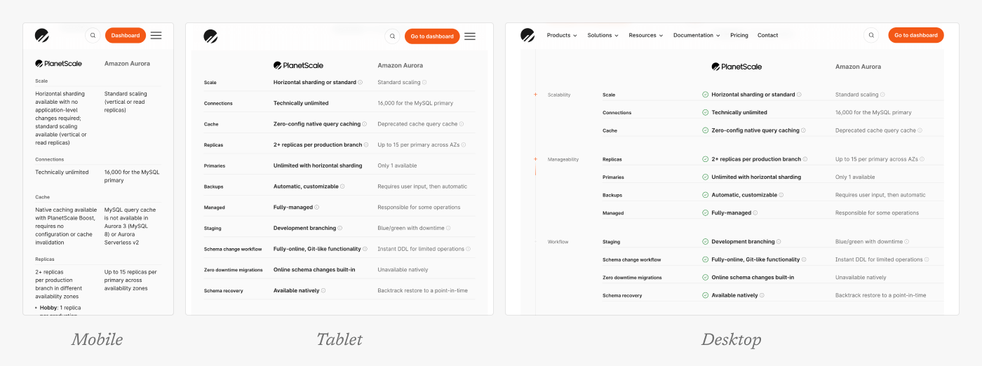
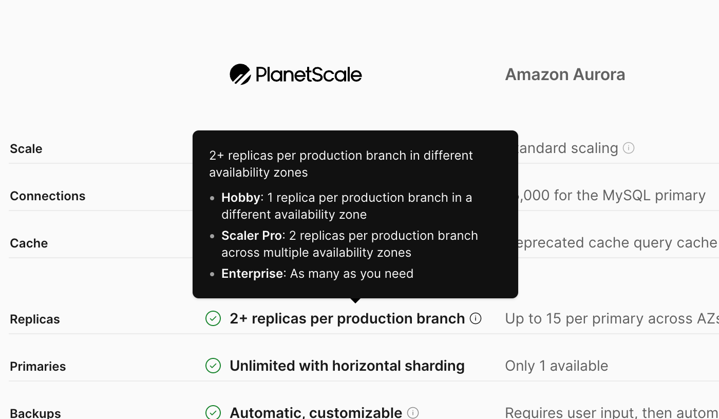
As expected, there's no easy way to build a comparison with the perfect length of copy in every cell. Different sizes of paragraphs everywhere were not the final look we were aiming for. Adding tooltips for all longer texts, was a simple but great way to balance having all needed texts but respecting the intended styling.
The shiny text uses text-fill-color: transparent, background-clip: text, background-size: 400%, and a gradient background.
To emulate the shine, the gradient needed a stronger cut in front, but a longer light trail. The final gradient looks something like this: linear-gradient(110deg, currentColor, var(--orange-500) 60%, var(--orange-200) 65%, currentColor 75%)
Then, we only need to update the data attributes to move the background-position from left to right, and animate the rest with CSS transitions.
<th data-animate={`${inView}`} className='group'>
  <span
    ref={ref}
    className='transition-[background-position] [background-position-x:100%] group-data-[animate=true]:[background-position-x:-35%]'
  >
    {children}
  </span>
</th>
Features carousel
While looking for references for this component, I ended up heavily inspired by Stripe's customer case study carousel, the interaction feels just so smooth and easy to navigate.
Using native scroll and web APIs, made it easier to have performant scroll and swipe interactions without third-party libraries.
The carousel uses CSS scroll snap with x mandatory to strictly align each element to the defined snapping points, and scroll-snap-align: center in each slide to horizontally align the current element at the center.
const Carousel = ({features}) => (
  <div
    className='scrollbar-hidden relative grid snap-x snap-mandatory auto-cols-[--video-width] grid-flow-col  gap-8 overflow-x-scroll overscroll-x-none before:w-1 after:w-[--video-width]'
  >
    {Object.entries(features).map(([id, { src }]) => (
      <FeatureVideo key={id} src={src} className="snap-center" />
    ))}
  </div>
)
To properly align the first and last elements of the carousel, the container uses display: grid and grid-auto-flow: column with ::before and ::after pseudoelements with 1px and full column width respectively.
By being a scrollable container, we can check for the currently active element using intersection observers, and scrollTo/scrollBy to navigate to different slides in the bottom tabs or once the current video has ended playing.
Reduced motion
All animations respect reduced motion preferences. In cases like the hero, the animation won't play and the pixel grid animation is replaced with a static grid.
For the customer logos, where in small devices is an infinite marquee animation. In addition to stopping the animation, the layout is adjusted to still properly display each logo.
 Motion reduced
Tailwind's motion-reduced and motion-safe were massively useful in achieving this easily:
const LogosMarquee () => (
  <div className="group">
    <ul className='flex items-center motion-reduce:flex-wrap motion-reduce:justify-center motion-safe:animate-slide-marquee'>
      {children}
    </ul>
    // Duplicated elements
  <div>
)
For components with more animations such as the diagram, we reduced animations by replacing multiple-level animations with simpler fade-in/fade-out transitions.
Or instantly transitioning between states as in the features carousel:
const getScrollBehavior = () => {
  const isReduced = window?.matchMedia("(prefers-reduced-motion: reduce)").matches
  return isReduced ? 'instant' : 'smooth'
}

const FeatureVideo = () => {
  return (
    <video
     onEnded={() => {
      //..
      document.querySelector('[data-features-carousel]')?.scrollBy({
        left: newLeft,
        top: 0,
        behavior: getScrollBehavior()
      })
     }}
    />
  )
}
Credits
Special kudos to @ceciliorz, @skullface, @thejessewinton, Yuri Hong , @taylor_atx, @jasonlong, and everyone else who contributed to this project!